Victoria Film Festival
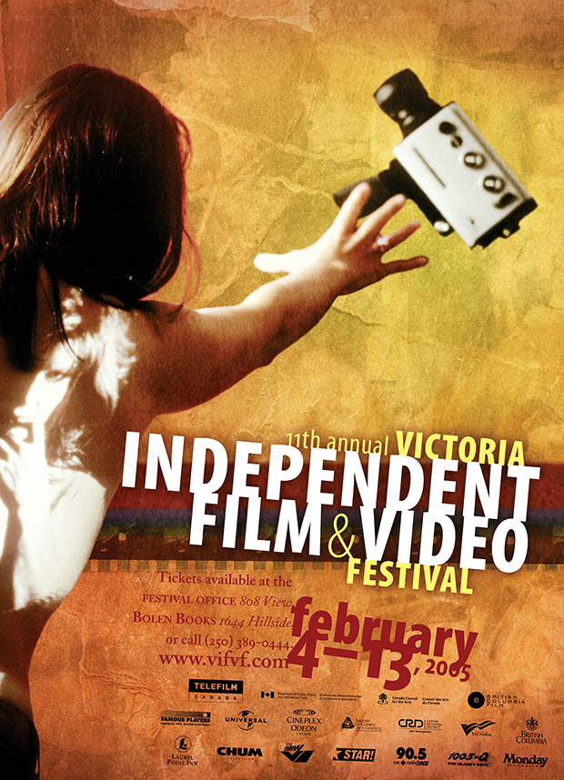
Rocketday was hired, at a late hour, to provide all the graphic design for the 2005 Victoria Film Festival. The previous graphic designer had quit, I was told, following creative differences. The festival director had commissioned a photo to use in the central poster and insisted on using it. This photo was dark and out of focus, of a woman with a projection on her back, reaching for a movie camera, which rested on a dark bookshelf, with a teddy bear on a shelf, all on a hot pink background. It was a particularly challenging photo to work from, and I could understand how any designer would have struggled.
However, I loved cinema and loved the energy of festivals, and decided that I was up for this challenge — to try to take this photo and somehow make it into a poster. I started by building a collage by ripping, pasting, and painting images from the festival’s previous films. This formed the foundation for a background texture.

collage/texture detail
I dramatically cropped the supplied photo of the woman reaching for the camera, and replaced the entire background with this new texture that I’d built. I then did a variety of treatments with colour and light, and added a strip of celluloid from a previous festival film. In the end, I was astonished that I was able to do something with this source photo, but it sort of worked for me now.

festival central poster
The rest of the festival work was extraordinarily intense, as I scrambled to try to make up for being hired so close to the festival’s launch. I worked long nights and weekends to design a large program guide, newspaper ads, signage, and promotional materials for related art exhibits and events. The workload was much greater than I’d expected. It was a painful season, as it affected my other clients and their timelines. I was now overcommitted, and it put stress on all these relationships.
One part of the festival was a three day conference called “Trigger Points Pacific”, which explored international industry connections. For this conference, we created a piece from scratch, which I still like.
At the time, my closest collaborator and friend was the artist Daniel Loxton, and we worked together on the Trigger Points Pacific artwork. He scanned and overlayed acupuncture diagrams onto an original photograph, which his wife modelled for. Together, Daniel and I built a collage that aimed to reference the central festival poster, as this was another projection onto the back of a figure. The image played with a concept — that Canada’s film industry could select strategic points in Pacific countries to work with, and (if done with care) these points could trigger resonant, cross-cultural collaborations.

Trigger Points Pacific program artwork

Trigger Points Pacific program booklet cover
art direction & graphic design
Emrys Damon Miller
Trigger Points Pacific photo illustration
Daniel Loxton
journal entry by Emrys